

After going to the london trip I put together a book all my heart watches I wanna make a cover for it how about it later and a brown ribbon with beads and sequins, I made the colour scheme of the cover match my project theme.

This contains all the blogs linked to the unit called “The Melting Pot”
After going to the london trip I put together a book all my heart watches I wanna make a cover for it how about it later and a brown ribbon with beads and sequins, I made the colour scheme of the cover match my project theme.
Posted by Esquerade on November 20, 2012
https://esquerade.wordpress.com/2012/11/20/my-fabric-swatch-book/

This is my finished moodboard expressing my colors and styles for the project
Posted by Esquerade on November 20, 2012
https://esquerade.wordpress.com/2012/11/20/my-moodboard/
 Arranging a final design on to a board can be rewarding and frustrating. You want it to look just right, you want it to stand out but how to arrange all the items onto your board to make it look right takes time. The rules I follow are, always keep a larger gap at the bottom then at the top, this is because if there directly in the middle they still look like there “falling” of the page, so put them just slightly higher. Also I like to arrange things into little groups, so fabric samples go in one area of the page, while the flats go altogether in another section. That way I feel people can look at what they want to look at easily with out having to look all over the page. Finally Sizes, I like my work to fit together nicely like a puzzle, so the more attracting items are large while the least attracting or interesting pieces are small. That way from afar people are enticed to come in closer to view the whole picture. I always find it difficult to find the right arrangement for my work so I generally just play around with it until I find a arrangement that I like.

Posted by Esquerade on November 20, 2012
https://esquerade.wordpress.com/2012/11/20/arrange-and-rearrange/
Today we had a presentation by Shingo Sato, A Japanese Designer and Pattern Cutter. I found his work truly inspiration, using very simple and easy techniques to create unique darts and shapes, practically sculpted from the fabric. I think Shingo’s work is fun and interesting taking an ordinary bodice design and create something futuristic, going against the normal dart positions and styles. I can’t wait to give some of his techniques ago, it gave me so much inspiration for dresses that I want to make for myself! With Christmas coming up what better time to make a new party dress. I was truely fascinated by Shingo Sato’s work and I’m sure you will be in awe by it to!
This is a link to his website and youtube account:
http://www.youtube.com/user/trpattern

Posted by Esquerade on November 14, 2012
https://esquerade.wordpress.com/2012/11/14/communicate-with-the-fabric-shingo-sato/

I think its getting a little full!
I think my book is getting a bit full after sticking samples of fabric manipulation and lots of beads, feathers, fur and chains!
Posted by Esquerade on November 7, 2012
https://esquerade.wordpress.com/2012/11/07/half-full-or-half-empty/
I have been researching into the slave trade of Africans and I came across a 6 part film series, all about a man named Kunta Kinte, and how he thought to be free, the film follows his bloodline. It was wrote by a man named Alex Haley, who had researched his own past after being told a story about a man being captured from Africa and he passed on his story so that his ancestors know were they had come from. I loved this film as it showed the true struggles of slaves, through there own eyes. It also shows how hard it was to keep your traditions and heritage, as american ways were forced upon Kunta Kinte including, changing his name, his language and even trying to change his religion. I think the beads in my work, should not only represent the chains but also the heritage and life they were stolen from. Each individual bead being a single memory, being held onto, to remain who you really are.
Posted by Esquerade on November 4, 2012
https://esquerade.wordpress.com/2012/11/04/remember-who-you-are/
Slavery is a difficult subject, especially when using it as inspiration, as it effected many peoples life As I have started to look into the Slave trade beads and slavery. I wanted to research what other fashion designers have been inspired by the history of slavery, if any. After a lot of research, I came across a few examples of slavery in fashion, and what peoples reactions to the work was. For example, Adidas released a shoe, which they later withdrew, because people had felt offended and felt the company were “ignorant” for releasing such a design. The design in question was designed by Jeremy Scott, which featured a adidas high top, with bright orange shackles, the audience found the shackles resembled chains that were worn by slaves, and the bright colours seemed to make the shoes seem light hearted and jokey towards the horrible past of slavery Although Jeremy Scott had stated that his work was in fact inspired by toys and his childhood memories. After looking at the toy he was inspired by called, My pet Monster. I can see how he came to his final design idea, with the use of purple and bright plastic orange cuffs. the toy being originally marketed as a toy for young boys in the 1980-90’s you can see why the shoe, is bright coloured and in fact doesn’t seem to hint at slavery in any particular way. I think the fault, was in the marketing as the shoe was pictured with the line “Got a sneaker game so hot you lock your kicks to your ankles?” This has no reference to the original source of inspiration and with just the words, “lock your kicks to your ankles” it sounds rather harsh and gives the image of imprisonment.
http://ca.shine.yahoo.com/blogs/fashion/adidas-shackle-sneakers-create-controversy-185000146.html
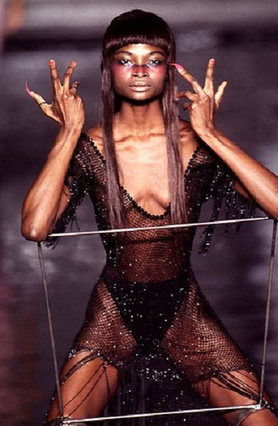
I also came across Alexander Mcqueen 1997 spring/summer collection, which featured a model walking down stairs in a metal restricting manacle, which looked very difficult and even painful to walk in. Many of the audience and people who viewed it linked the idea to slavery, which Alexander Mcqueen denied, as he actually meant for it to imitate a puppets movement. As mentioned in the book “Fashion at the Edge” By Caroline Evans.
http://blog.metmuseum.org/alexandermcqueen/video/
I also came across another designer, Carlotta Actis Barone, who was inspired by slavery and racism, her colour palette for her outfits being different shades of skin colours. The clothing was inspired by slaves work clothes but she emphasised the size of the shoulders, which showed the muscle and strength the slaves had. She also used the slave for sale advertisements as undergarments. I feel this might be to show how we have tried to hide the past but it is still there in every one just beneath other things. I think she is brave to create a collection with such a controversial subject. Although I think fashion should be used in this way, if people do not bring up things from the past then how are we to remember them and learn from them for the future. We cannot hide everything. I think this collection is respectful towards the slaves, which I think needs to be done as these people suffered for no rightful reason.
http://katchmedia.wordpress.com/tag/fashion/
http://www.carlottaactisbarone.com/

image from http://katchmedia.wordpress.com/tag/fashion/
Posted by Esquerade on October 31, 2012
https://esquerade.wordpress.com/2012/10/31/fashion-is-a-art-statement/
After staring at blank pages in my sketch book, being to scared to touch it and ruin the crisp blank pages with my ideas. I decided to look at the beads as a currency, there use for purchasing items such as traditional African fabrics and how I can recreate some of those bright, detailed patterns. Then I looked at the purchase of food and how Africa is commonly shown as being a place of poverty with images of children starving. After, I think I have finally got a decent flow of inspiration for this cultures project. I was researching about beads and African beads and how they were made, when I came across the name ” Slave Beads” I had heard it before, in the museum. So I decided to research, what slave beads actually were. I came across a site, http://www.ezakwantu.com/Gallery%20Trade%20Beads%20Slave%20Beads%20African%20Currency.htm which spoke about the beads being a currency, which I had already found out from a museum, but also told me Europeans used these beads to purchase Africans as slaves hence the name slave beads. I found this a little upsetting, as I couldn’t grasp, how any one would trade a bead for a human soul. But the beads were a symbol of status and could ward of evil spirits. As well, as something a king could wear. Then its a little easier to understand, as these beads had a very high importance to the African culture. It then made me think about how this must of made the slaves feel. how would I feel if a bead was worth more then myself. I would hate it, something usually used to decorate and look beautiful. Have been used to chain a person to a live of slavery and misery. Which gave me the image of some one being chained in beads, something once a symbol of status, is now a symbol of Slavery. I am going to carry on my project looking at ways to create styles that can fully represent the darker side of these beads, rather then just there normal beauty that every one sees.
Posted by Esquerade on October 30, 2012
https://esquerade.wordpress.com/2012/10/30/when-the-inspiration-comes-it-pours/
After Looking at beaded items in the Pitt Rivers Museum, I have decided to research in particular the beaded products from Africa. I started my research by looking at a few books, “Africa – Arts And Cultures” Edited By John Mack and published in 2000, by British Museum Company Ltd. I found that most elaborately beaded items belonged to the kings of Africa. If any one was seen wearing elaborate beaded items, who were not of royalty were punished. In Particular, Yoruba people from Nigeria say “Irinisi Ni Isonilojo” Which means you are what you wear and that you wear what you are. Clothing is there to show the person behind the clothes. Also I found that the most significant item for a king to wear is the beaded crown, “ade ileke” There are two types, one used for public ceremonies and another used for court, The public headdress usually the more magnificent of the two.

19th Century Ade Ileke, From the book “Africa Arts And Culture”
Also the King would wear Beaded shoes outside of the palace, this is predicted to have come around during the 17th century as Kings, were required more and more to leave the palace and attend public ceremonies. I think these Items are all very beautiful and must of take a very long time to make, I love the colours that are vibrant but can be seen to be now rather dark due to age. I want to replicate this sense of authority and age in my own work. I also looked at an older royal crown from the 15th Century, In Benin Nigeria. These were alot more basic compared to the 19th century and followed one colour scheme. This crown was made out of Coral, Agate and copper while the 19th century was made of Glass, Textile, Metal and cotton. This list of materials clearly shows the difference in culture between places like England and Africa. English Kings were adorned with gold and jewels rather then coral and copper. Yet the African headdress’s seem more appealing and interesting to me, with there bright colours and imagery.

My sketchbook
Posted by Esquerade on October 27, 2012
https://esquerade.wordpress.com/2012/10/27/the-melting-pot-africa/
This Week, I have been very busy after creating some work for my sketch book, for the unit “Melting Pot” I have been looking at Africa and there woven beaded work, that has come to Europe through various trades from travellers. During lectures, we have been creating sketches from our imagery and research. I personally hated them at first, the rough lines, the imperfect proportions. I wanted to spend longer then five minutes on each drawing. After creating an entire page of sketches, I started to let go and relax and thats when I found I could design so many different styles. I actually started to enjoy the quick rough sketches that portray a basic idea that could be later developed. It started to love the quirky little designs, I experimented with using pens, pencils and liners to draw my sketches. I also want to try watercolours and paints to create quick designs.

We then moved onto technical drawings. Completely different to rough sketches. Now your not allowed to be imperfect or rough. Now you have to be perfect with perfect proportions. I felt like I was going round in circles, one moment it doesn’t need to be perfect and the next it does. Oh, Fashion Design, how I love you! I enjoyed technical drawing, we had to create a technical drawing for the jacket or item of clothing we were wearing. As I love to go for comfort, I had a Nightmare Before Christmas Fleece with embroidered imagery on it. I had to draw all the stitches onto my Technical Drawing including the embroidery! But I finally realised how much work actually went into the clothes I wore, yes I know that they are designed and sewn together, but you don’t realise how much design and stitching go into the garment until you break it down. I think I will improve on my Technical drawings over time as I practise it more, as sometimes I did have the proportions perfect.

Finally I went onto Fashion Illustration. By far my favourite area of design. Although I haven’t drawn my own croquet since GCSE, I had fallen out of practise, but after experimenting with the 9 head technique and my own style of drawing which was highly inspired by anime and manga, a Japanese stylised graphic. Which I was obsessed with during secondary school, I would spend every evening drawing new anime characters. I then wanted my illustrations to show me as a person, so I thought about what bought me into fashion designing. I’ll be honest it was a doll when I was a kid. A Bratz Doll to be precise. I loved there eyes, that reminded me so much of anime eyes, there odd body shapes, long legs, big heads and feet. These were the biggest fashion doll on the market, (Battling with barbie and mattel who released there own fashion doll soon after called my scene). They were beautiful and had so many unique styles, they taught me that I can be confident in what I wear, because every ones different. Each doll, had its own personality and style unlike the barbie doll. I grew up, with the love for being unique in my own style and being confident in myself as well as loving cartoons, Anime, games and Bratz dolls. I wanted to incorporate that into my fashion illustration and came up with these designs for a croquis.

Posted by Esquerade on October 17, 2012
https://esquerade.wordpress.com/2012/10/17/childhood-the-memories-of-adulthood/

 Switch-a-Witch Single Pack")

 - Brogan/Pirate")
